
Haggard Childcare Resource | University of Washington
Refreshing a Montessori Childcare Resource Website
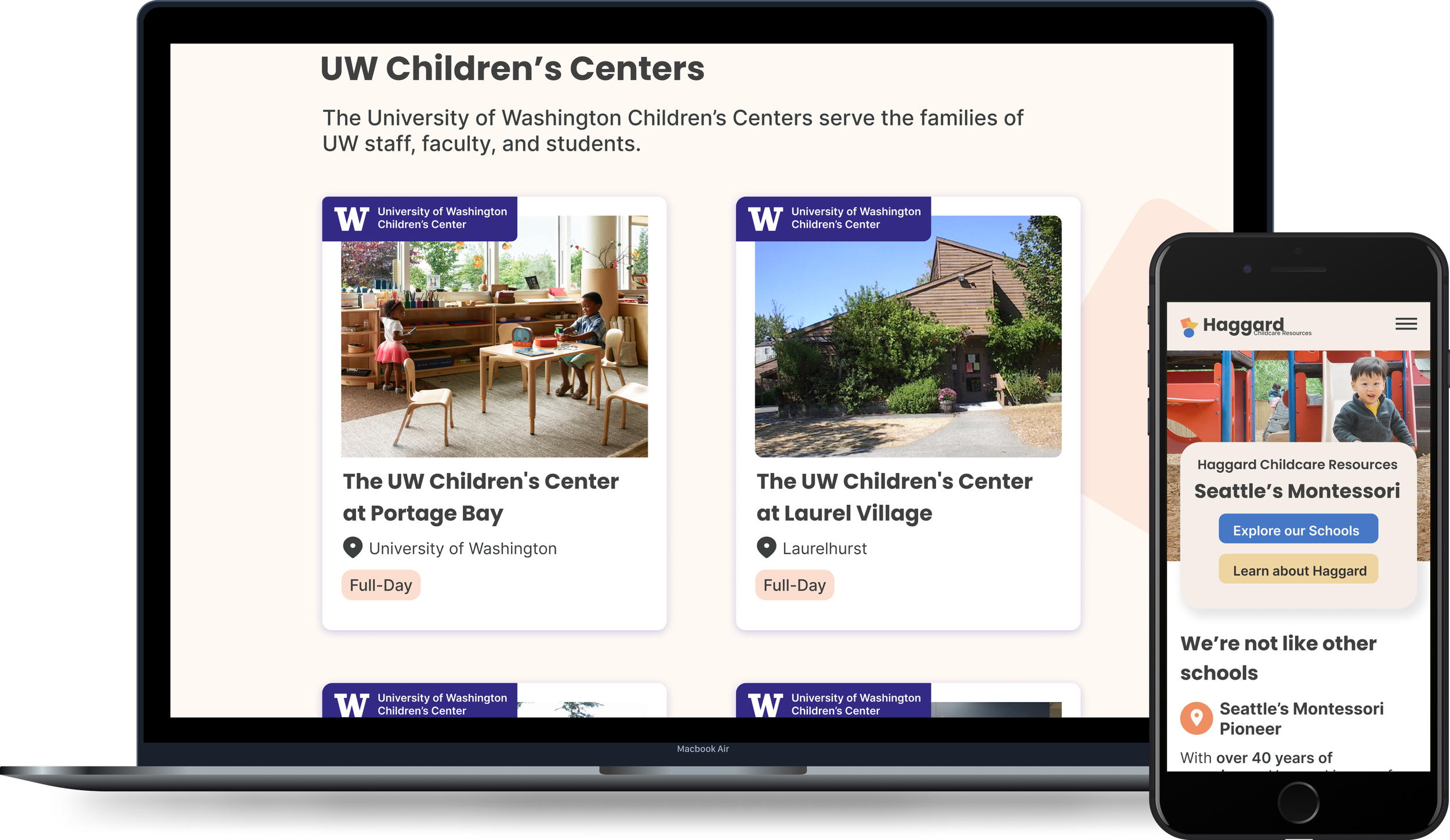
Haggard Childcare Resources, a Montessori institution with a legacy of over 40 years in Seattle, oversees eight schools, four of which are affiliated with the University of Washington.
Role: UX Designer + Researcher
Timeline: 10 weeks
Problem
The existing website suffered from an unclear organization of information, outdated content, difficult interactions and a lack of a cohesive visual identity.

Solution
My team and I implemented a task-based approach to streamline the information architecture, conducted content audits, improved interaction usability, and infused the company's philosophy into visual design.

Project Goals:
Increase student applications by improving user flow for accessing application
Reduce caregiver inquiry calls through offering accurate and accessible information on the site

Main Challenges
1/4
Simplifying Complex Information Architecture:
I conducted an unmoderated open card sort with 12 parent and staff participants using Optimal-Workshop. The resulting information architecture diagram was synthesized using dendrograms and a similarity matrix. Through this process, my team and I identified more suitable groupings for key terms, allowing us to propose simplifications. One notable example is consolidating all information about Haggard Childcare Resource into a single "About Us" page and replacing “Children’s Centers” with the more familiar term “Schools”

Before

Initial Complex IA with outdated items like Seattle Infant Conference
After

Updated Simplified IA, with more plain language labels
2/4
Updating Redundant, Obsolete, Trivial (ROT) Content
After conducting a comprehensive content audit of the 14-page website, encompassing both quantitative and qualitative assessments, we identified numerous cases of redundant, outdated, or inconsequential information. This included details about schools that are presently inactive. Additionally, it became evident that several pages lacked clear user prompts, such as noticeable call-to-actions on the school pages.
Based on insights from user interviews, we redefined the content to align with the objectives of our personas. This involved prioritizing key tasks like acquiring information about a school and easily locating the nearest one with availability. We ensured that content effectively communicated Haggard's distinctive values This user-centric approach aimed to provide a more intuitive and purposeful browsing experience.
Before

Trivial Content about the history of Montessori which does not assist with user tasks.
After

Task-focused Content which aids in task completion (i.e., Applying for a position at Haggard)
3/4
Establishing a Visual Identify
My team and I asked surveyed people associated with Haggard Childcare Resources (Parents and Staff) what they thought about the company. They told us that they see the organization as being about creating a safe environment, being uniquely friendly and child focused, and the importances of nature and community. We used these ideas to shape how the company looks and built a design system in Figma.
We also collaborated with a parent who was a photographer to generate new images of students and teachers for the site.

Updated branding our team developed to support website design
Before
Existing Website has no established design system. Blurry images, uninspiring logo, and lack of visual cohesion all lead to the site feeling outdated.

After
Updated website with design system, a logo, balanced fonts, and new photos give the site a whole new feeling of professionalism and trust.
4/4
Streamlining the Application Process for Parents
The current website lacks a direct application feature, requiring interested parents to contact the school, receive an emailed form, and then join the waitlist. Our research indicates that a significant number of inquiries to the main office pertain to the waitlist procedure. To address this, we aim to create a streamlined process that outlines the steps, offers a downloadable application form, and includes a Frequently Asked Questions section to diminish the need for calls to the main office.

Sketches of wireframes, iterating on prototypes until the best idea landed.

Final version of the application process with clear steps and actions.
Reflection
Looking back on our work with Haggard Childcare Resources, it's clear that our focus on what really matters to parents and staff has made a significant difference. They shared with us how they see the organization - as a place that's safe, friendly, and most importantly, centered around children. These insights became the cornerstone of our design approach, guiding us to create a website that truly reflects these values.
Collaborating with a parent who's also a photographer brought a personal touch to the images, making the web experience more relatable for visitors. We took a close look at the content and structure of the existing website, making sure everything was clear and easy to find. One big improvement we're excited about is streamlining the application process, which we hope will make things much smoother for parents. Looking ahead, I'm confident that these changes will make a positive impact on the overall experience for everyone using the site.
