Move Your Way Activity Planner | Office of Disease Prevention & Health Promotion
Redesigning an Inclusive Tool to Help People Get Active Safely
ODPHP's Move Your Way campaign designed an activity planner to help users build more activities into their day. Users select from a wide range of personalized activities which they can filter based on motivations and interests.
Role: Lead UX designer at CommunicateHealth
Timeline: 14 weeks
Problem
The client was interested in identifying opportunities to redesign the tool to increase mobile usability and better serve a new audience of pregnant and postpartum users. Additionally, they noted wanting the site to be optimized for mobile users as this made up the majority of their web traffic.

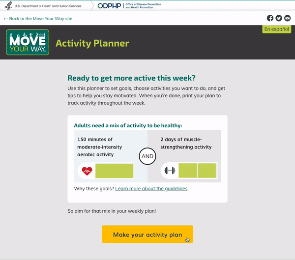
Starting mobile homepage – note how much scrolling is required to get to main CTA
Solution
I proposed leading with a thorough evaluation of the tool, pinpointing areas requiring improvement. This included a focused assessment on aligning it with our new priority audience, pregnant and postpartum users.
Next, I designed wireframes which were carefully reviewed with development and content team to imagine how these changes could look and work ensuring the tool catered specifically to user needs and preferences. This involved streamlining content, optimizing navigation, and enhancing user interactions.
To validate these improvements, my research team conducted rigorous testing with pregnant and postpartum users which I was able to sit in on. Their feedback guided further UI refinements, guaranteeing the tool's effectiveness and usability for our intended audience.
Project Goals:
Prioritize mobile usability for the redesign, as it constitutes the majority of the client's web traffic.
Align the tool with the new priority audience of pregnant and postpartum users to ensure it caters specifically to their needs and preferences.
Conduct rigorous testing with pregnant and postpartum users to validate the proposed improvements and incorporate their feedback into further UI refinements.
Main Challenges

1/4
Optimizing the Landing Page for Mobile
Since the tool wasn’t originally designed with a mobile-first approach, the landing page told a different story to desktop users than mobile users. The desktop version provided users with a graphic that explains the Physical Activity Guidelines that the tool is based on. The mobile version expected users to scroll past the logo, and due to stacking, they were served the graphic after the main action.
I proposed introducing filters earlier in the flow, inspired by a custom food delivery service. This streamlines activity selection, providing a sense of personalization—a recognized Health Literacy best practice.
Collaborating with content teams, we restructured filters, added new ones for new and expecting parents, and refined language to be more personalized. We prioritized a skippable "Why" selection, a proven behavior change tool, to engage users effectively.
Before


Initial Landing Page - Majority of content is pushed off the screen, inaccurate stacking places key information below CTA
After

Updated Landing Page makes it easier to get the gist of the tool without much scrolling
2/4
Streamlining the Activity Planner’s Filter Selection
After the user presses the landing page CTA they dropped off in the activity planner without any experience of selecting activities. Users are expected to press “Personalize your activity settings” to access filters, but there were several participants who did not notice this filter or were unsure what the button meant. Without filtering, users may get overwhelmed by the 57 activities to choose from, and potentially pick unsafe ones for their situation.
I proposed introducing filters earlier in the flow, inspired by a custom food delivery service. This streamlines activity selection, providing a sense of personalization—a recognized Health Literacy best practice.
Collaborating with content teams, we restructured filters, added new ones for new and expecting parents, and refined language to be more personalized. We prioritized a skippable "Why" selection, a proven behavior change tool, to engage users effectively.
Before

Initial filters are hidden under a vague CTA, don’t allow multi-select, some require multiple interactions
After

Users first select motivation and then specific activity filters making their process much easier to navigate through.
3/4
Incorporating Specific Content for New and Expecting Parent
With the inclusion of activities for new and expecting parents came a client requirement to include information about being active during these times. This gave me the opportunity to rethink how this page can function and apply best-practices to improve how users interact with it.
The first thing was to bring focus to the tool by tightening the logo and headers. A sticky box with labeled aerobic and muscle activity bars now leads the page instead of appearing with scrolling interaction, introduce its functionality organically.
Below this is the tailored content for new and expecting parents above the activity list — including a reminder that the tool is showing a narrower range of activities because they selected the "pregnant" or “postpartum” filter.
I also worked with content team to include labels for the activity bars so there was additional context of what information should fill these blocks.
One final suggestion was to replace “Week” with “Plan” since users were designing an activity plan.
Before

In initial version the activity bar doesn’t show up until after the user scrolls and then locks into the top. This proved confusing to users.
After

Updated version leads with explanatory activity bars, and has space to have expecting-parent specific content
4/4
Usability Tweaks for Activity Input Pop-Up Modal
Based on my evaluation, I made several improvements to the activity input modal:
I placed the activity type (aerobic or muscle-strengthening) right next to the activity title for clearer understanding.
I reorganized elements to allow for longer descriptions, reducing the need for excessive scrolling.
Default values are now set at 10 minutes and 1 day, making it quicker for users to add activities to their plans.
I replaced the "X" with a more intuitive "Cancel" button.
I changed the wording from "Add to your week" to "Add to your plan" to match my previous recommendation
Before

Initial modal required interactions to even fill out basic information.
After

Updated modal makes it easier to see the type of activity it is, and streamlines inputting time and days by defaulting.
Reflection
Working on this project as a UX lead was a rewarding experience, especially given the trust and autonomy I had in making recommendations. Collaborating closely with developers was crucial to ensure that our solutions were not only creative but also practical and accessible, ultimately contributing to the product's success.
While the tool prioritizes inclusivity for non-binary expecting and new parents, I also saw an opportunity to inspire a broader audience to be more active. I envisioned filters tailored for users with limited mobility, such as providing post-hip replacement exercise suggestions. Although this wasn't within the project's scope at the time, it's a potential enhancement for a future update.
We presented the wireframes to the client, walking them through our approach alongside my team. Their approval prompted a redesign of the tool, a pivotal step in refining its functionality and usability.
I'm delighted to share that the tool is now live on the U.S. Department of Health and Humans website. If you're curious, feel free to check it out in action!