MITRE | Sara Alert
Simplifying symptom reporting for those exposed to COVID-19
MITRE's Sara Alert is a system that allows people who have or may have COVID-19 to quickly and easily report their symptoms to their state or local health department each day. My team has been tasked with redesigning the Sara Alert user experience and conducting research to improve tool usability and symptom monitoring so it is easier to use by people with limited literacy skills or limited English proficiency.
Role: Lead UX designer, Secondary Researcher at CommunicateHealth
Timeline: 10 weeks
Problem
In response to the COVID-19 pandemic, our client sought our expertise to address critical usability issues within their service framework. This encompassed streamlining enrollment procedures for COVID-19 reporting, ensuring strict adherence to the mandated two-week symptom reporting period, and providing accessibility for individuals with English as a second language. The urgency of the situation demanded swift and effective solutions to these multifaceted challenges, driving the need for an innovative approach.
Solution
Our team implemented a comprehensive solution tailored to enhance the initial reporting process. We revamped the reporting interface, prioritizing user-friendliness and clarity to ensure seamless comprehension, particularly for non-English speakers. To reduce interaction costs for larger families, we integrated a streamlined family reporting system, allowing for collective symptom reporting, thereby optimizing efficiency and accessibility for all users. To validate the effectiveness of these changes, we conducted usability testing, gathering valuable insights from users to further refine and tailor the service.
Project Goals:
Streamline the initial COVID-19 reporting process for users of all language backgrounds.
Enhance reporting usability and clarity, particularly for individuals who have limited literacy skills or limited English proficiency
Implement a family reporting system to reduce interaction costs for larger families, ensuring efficiency and accessibility in symptom reporting.
Main Challenges

1/4
Improving Text Reminders for Symptom Reporting
The current Sara Alert monitoring process lacks efficiency and user-friendliness. The head of household receives multiple messages with separate links for each family member's symptom report, resulting in a total of 70 individual forms over a two-week period (for a 5 person family). This creates a significant barrier to adherence. Additionally, the current messaging system lacks a conversational tone, uses mechanical names, and doesn't provide sufficient context for user input. The need for a more streamlined and personalized approach is evident.
I recommended sending the head of household a consolidated link for daily symptom input, along with a more user-friendly text message. This approach employs a conversational tone, uses familiar first names instead of generic codes, explicitly lists household members, and streamlines the process with a unified entry point, reducing the need for constant navigation between messages and links. Additionally, it eliminates the use of 'below', considering varying screen sizes.
Before

Initial text message are robotic, redundant, and require too many interactions for larger families
After

Updated version now provides a single link, uses names instead of initials+age code, and has a more conversational tone.
2/4
Enhancing Communication and Usability of Daily Self Reports
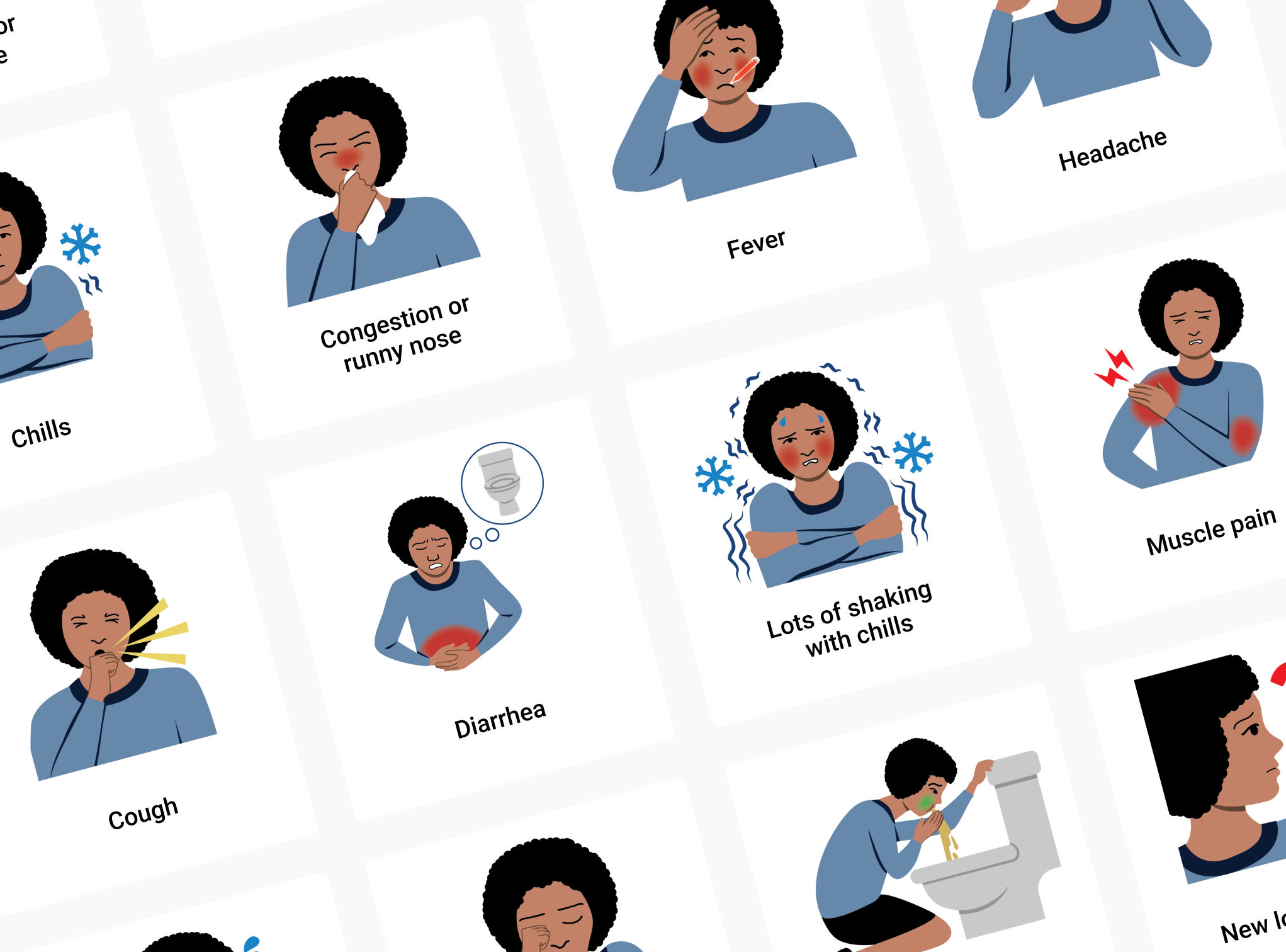
Each day, Sara Alert users must complete a self-report, detailing all experienced symptoms. There are difficulties in understanding these symptoms, especially for those whose first language isn't English. As the tool expands its reach, a crucial requirement emerges for a universal communication approach to ensure effective comprehension and utilization.
Based on research, we developed pictograms as it was the most effective communication for a diverse audience. Collaborating with a graphic designer, we created an illustrated character displaying symptoms. We refined the pictograms with feedback from 35 non-English speakers.
After deciding to incorporate graphics, I designed a tile card interface. This solution ensured seamless, responsive usability across diverse screen sizes, given the tool's accessibility on various devices. It also enhanced user precision in symptom selection compared to a small checkbox.
Before

The initial daily self report was difficult to interact with. Small checkboxes and use of English word only made the tool inaccessible to many people who needed this tool.
After

The updated self report allows users to quickly browse custom illustrations of symptoms and select the relevant symptoms efficiently.
3/4
Reduce Interaction Cost for Larger Households
After suggesting the use of a single form link for the head of the household, I proceeded to develop a user flow to facilitate this process.
Drawing inspiration from the user interface used for selecting plane seats, I proposed allowing users to choose symptoms for the entire household and assign them to specific members. My rationale was based on the likelihood that many household members may be experiencing the same symptoms.
Draft Concept / Wireframing
User flow wireframe for assigning symptoms with family members made in Whimsical

Final Concept

Prototype of selection interface made in Figma
4/4
Post-Usability Testing Insights
Insight #1:
Users wanted the tool to lead with the names of household members, rather than symptoms. This finding contradicted my initial assumption that users would prioritize symptom selection. In response, I restructured the flow to emphasize individual members on each page, allowing the head of household to allocate symptoms more effectively.
Before

Initial user flow had users select symptoms first, and assign them to household member
After

Updated user flow has users select household members first and assign symptoms to them if needed
Insight #2:
Several users quickly filled out the form without reviewing the symptoms because no symptoms was prioritized visually. A couple users anticipated seeing an option for "None of us have any symptoms" at the bottom of the screen and actually scrolled to the bottom to find the choice. To address this, I relocated the "no symptoms" option below the symptom choices to encourage users to review the options before making a selection.
Before
Initial design led with “They're not having symptoms” option. Some users did not review the symptoms, and just selected no symptoms without reviewing options, while others expected it at the bottom of the symptom list.
After

Updated design has no symptoms option below all symptoms to encourage users to review symptoms.
Reflection
Working on this project during the COVID-19 pandemic added a layer of urgency. We had to shift to remote interviews since meeting face-to-face wasn't possible. This brought its own set of challenges, like ensuring smooth virtual connections and keeping sensitive information secure.
The client's goals kept changing as the situation evolved, which required us to be highly adaptable. Despite these hurdles, the project turned out to be a big success. We were able to provide crucial real-time insights. This experience really showcased our team's ability to excel in fast-paced, high-stakes situations, and how we played a part in the broader effort to combat the pandemic.